Archinteriors vol. 32 collection is available here.
My main goal was to combine two quite different lighting sceneries – normal, sunny daylight with warm, orange artificial light. At first I matched camera in my scene to my reference – for this purpose I've used BLAM addon (Blender Camera Calibration Toolkit). It's a very simple 3 step process:
Click on image to enlarge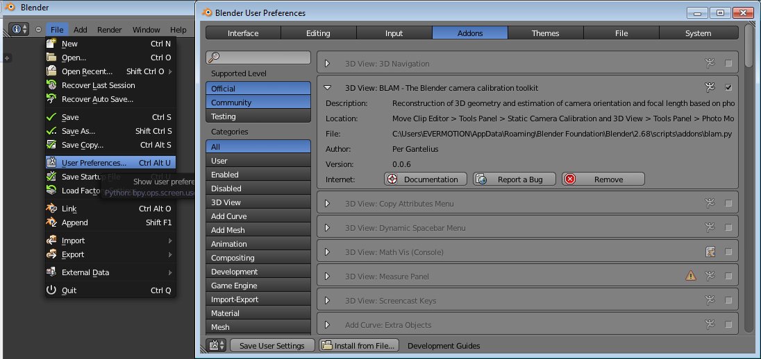
Import reference image into Movie clip editor
Click on image to enlarge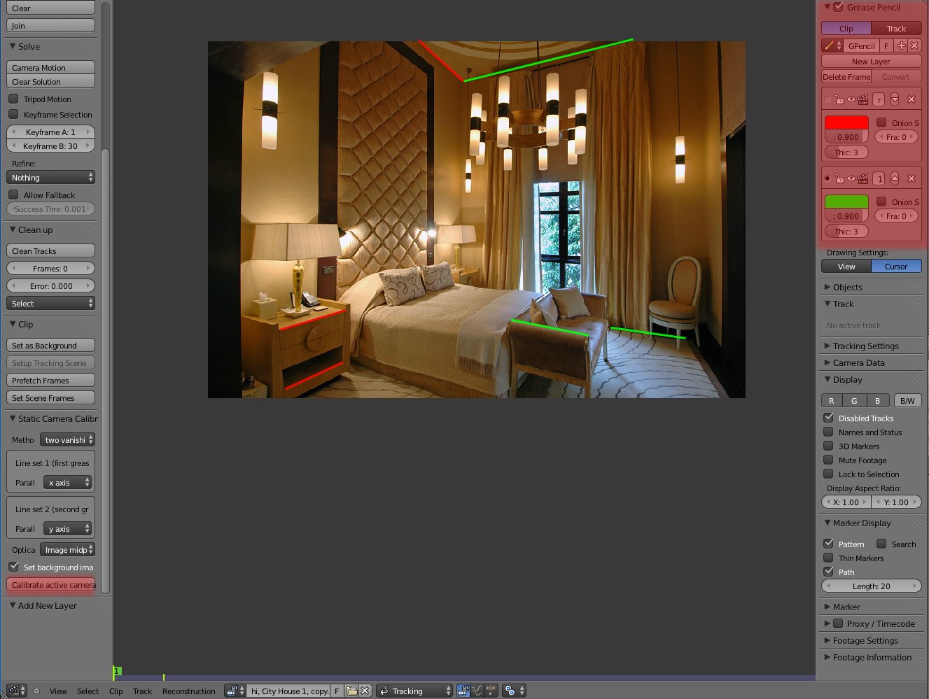
Draw two grease pencil layers (to draw straight lines just press Ctrl + d) – first for the X axis and second for Y and hit calibrate button and BLAM will match your active camera to the image.
Click on image to enlarge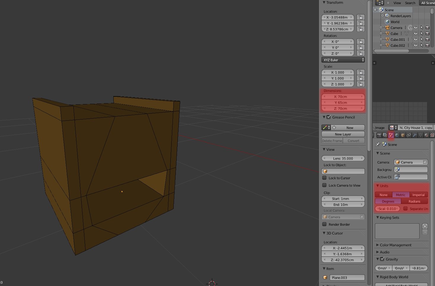
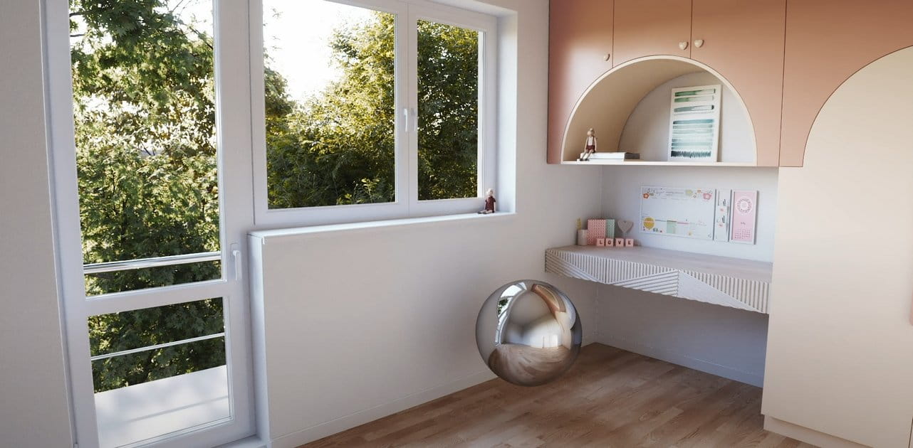
The blocking phase was also done in Blender. I started with a simple cupboard – when the basic shape was made (in perspective) I've changed units setup to metric (0.01 corresponds to 3ds max units) and scaled to real life dimensions (height about 70cm).
Click on image to enlarge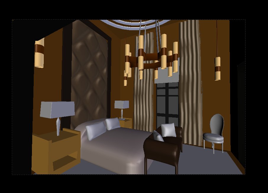
Having one element of “the puzzle” right I could made other correspondingly. Finished blocking phase. The models are still very rough but I prefer this workflow – iteration based, because from the start I see which elements would need more polishing (and I don't model things or details which won't be visible in final render).
Click on image to enlarge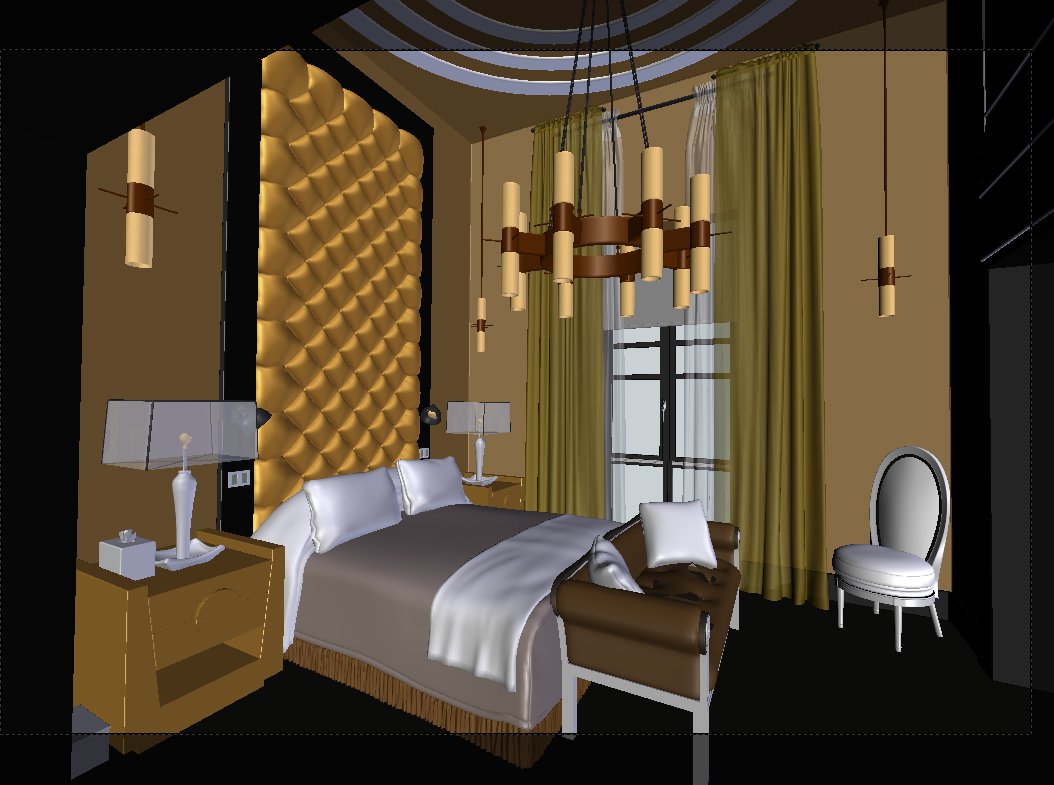
Now it is a time for replacing models with final geometry – most of them are quite simple, so I show only the more interesting ones.
Click on image to enlarge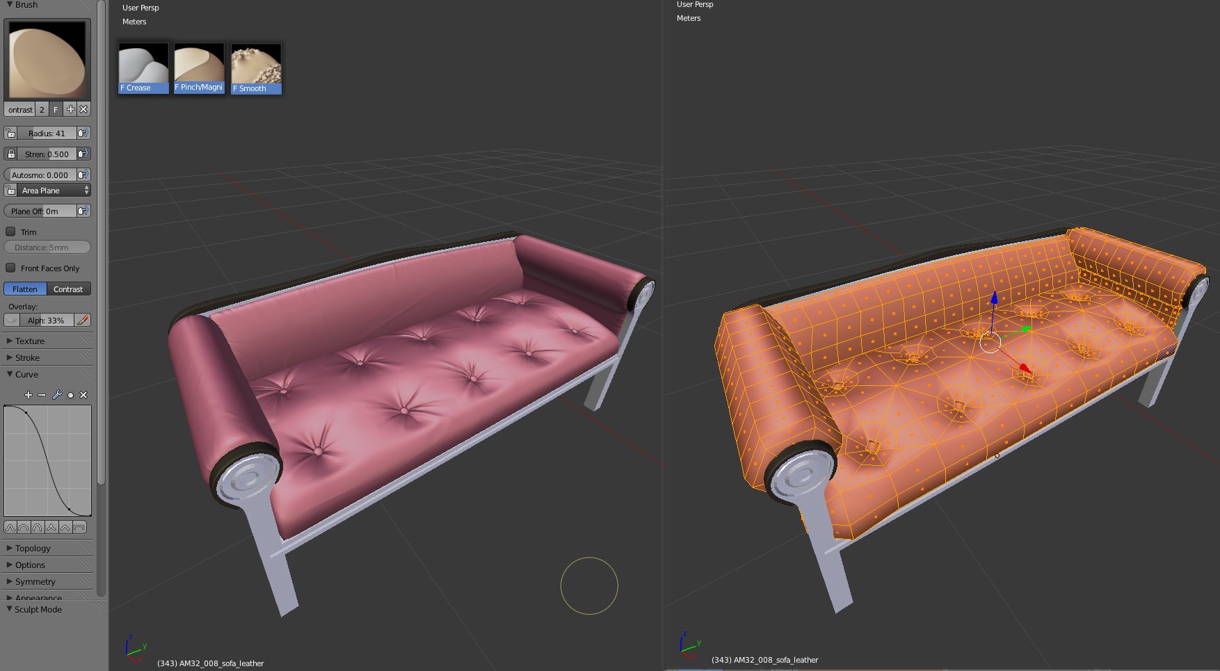
Sofa – after making the base mesh I've added multiresolution and sculpted the wrinkles (I've used mostly 3 brushes: Crease, Pinch and Smooth). It's very important to change the brush size very often (it adds variation to folds).
Click on image to enlarge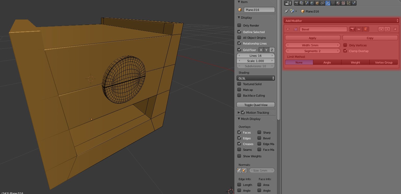
Cupboard – every object in the scene has chamfered edges. Although Blender can bevel edges in edit mode, I prefer to use bevel as a modifier. This way I have greater control - my model is more procedural. When I change proportions of my model, the bevel stays the same. The only downfall of this method is that I get occasional UV mapping errors. They can appear if the object was mapped prior to beveling.
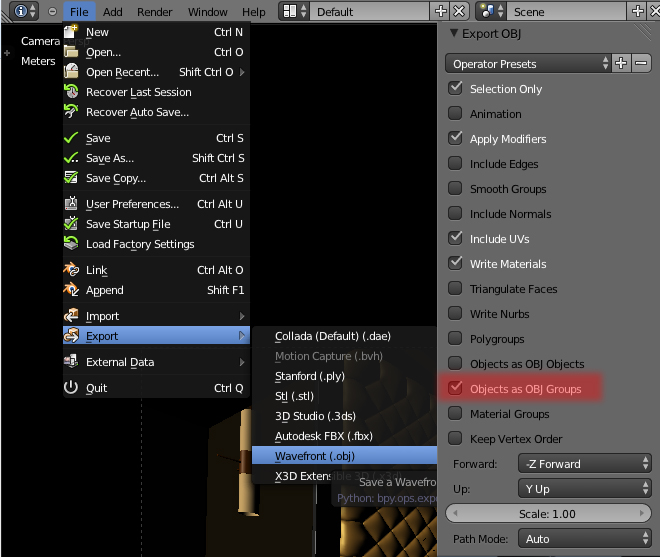
I exported all meshes as a obj and imported this file to 3ds max, because the scene was meant to be lit and rendered in VRay.
Click on image to enlarge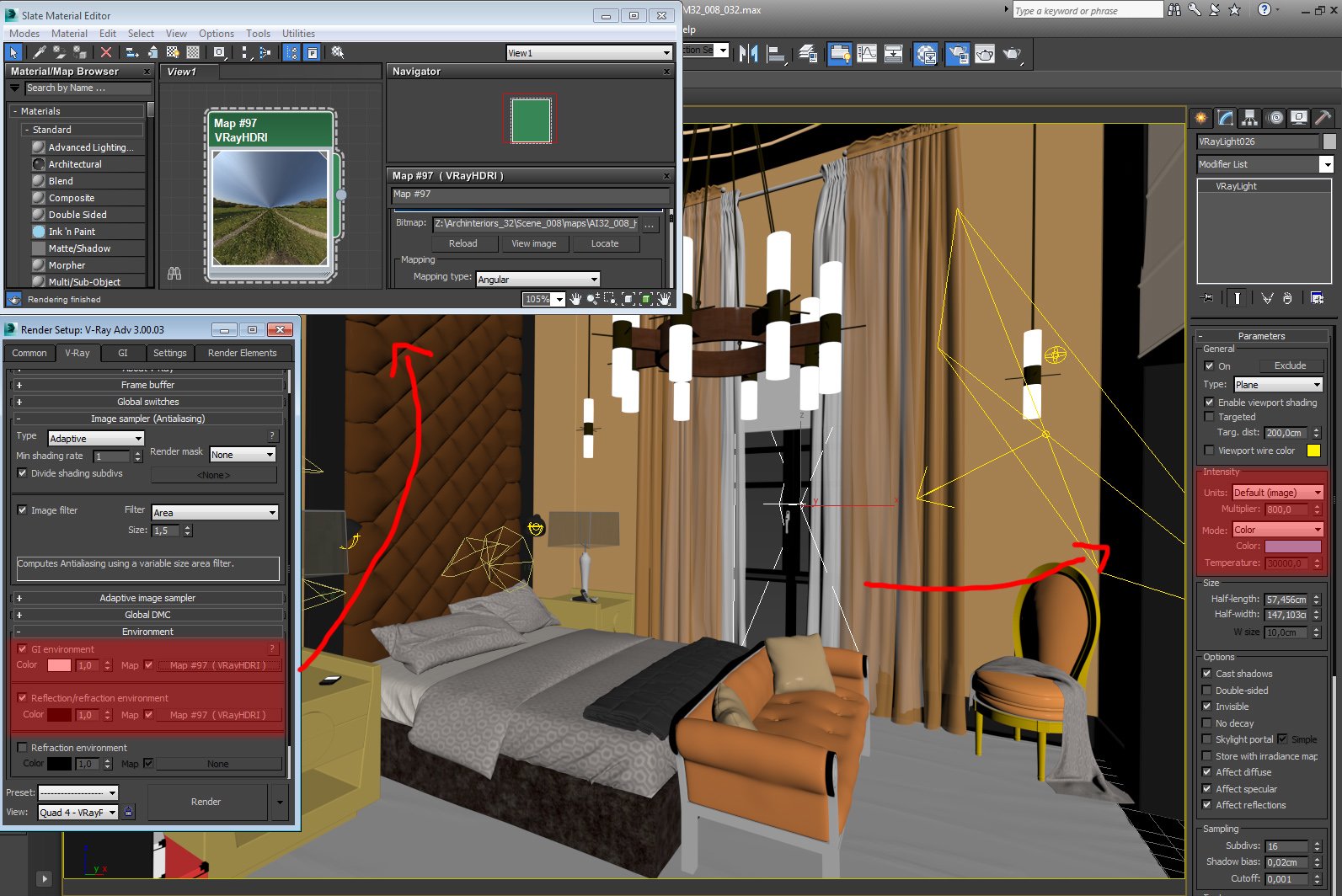
For the daylight I used HDRI image in the background (to achieve ambient tint) and a strong bluish Vray light (this gave me more control than Vray Sun and Sky)
Click on image to enlarge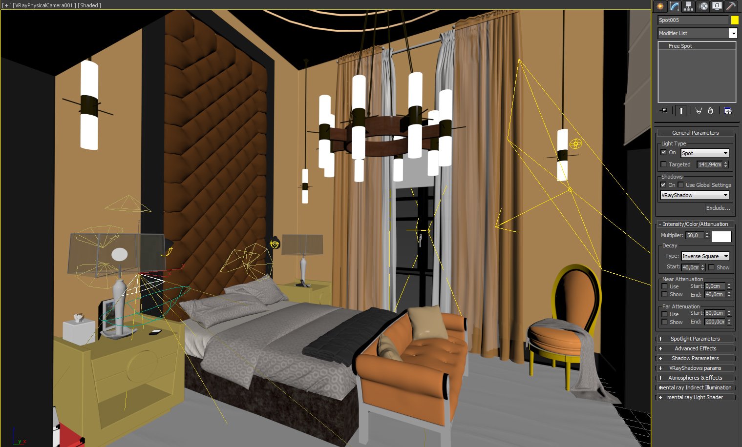
The small lamps were more demanding – I wanted them not only to have a specific shape (like ies lights) but also sharp shadows. That's why I used mostly simple spot light.
Click on image to enlarge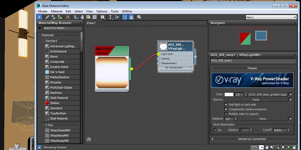
For the chandelier lights at first I tried to use small Vray lights covered by glossy glass but rendering times were to high (also noise level was unacceptable) so finally I went for simple gradient textures with Vraylight material.
Click on image to enlarge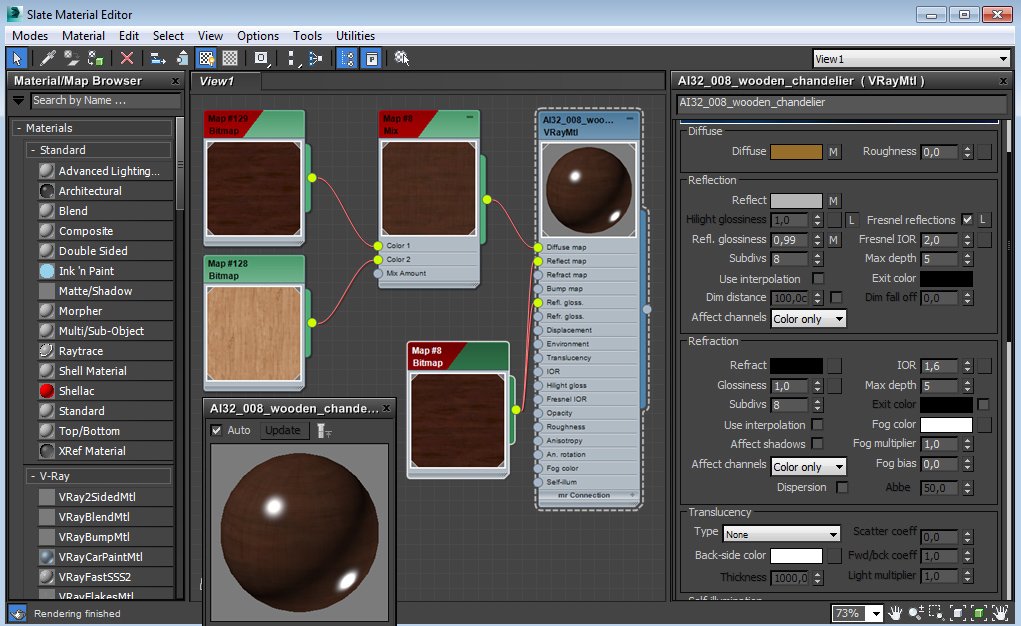
Materials were also quite simple – I used some color corrections and compositing - I prefer to see results instantly than to go back and forth to Photoshop.
Click on image to enlarge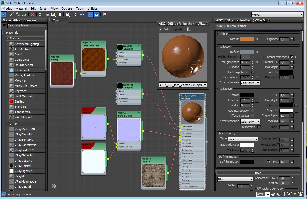
Materials
Click on image to enlarge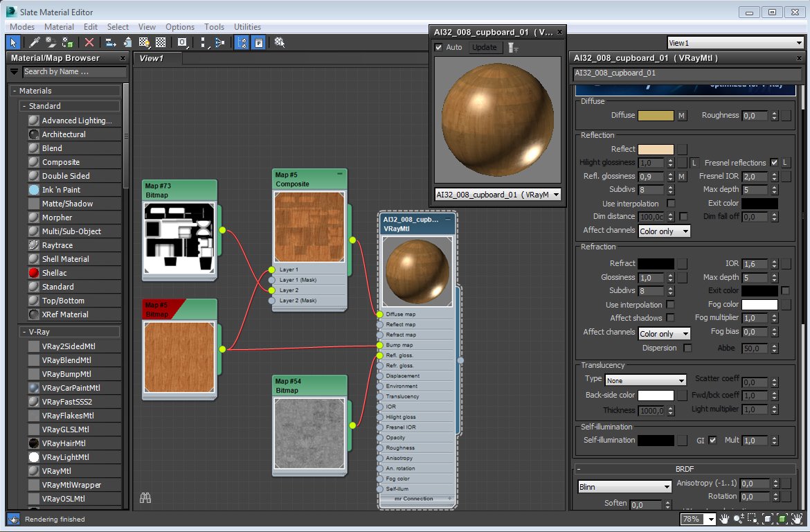
Materials
Click on image to enlarge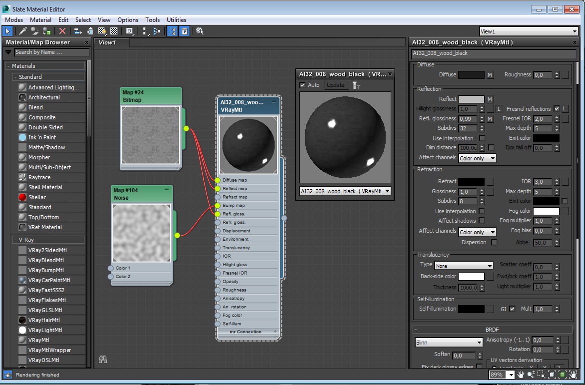
Materials
Click on image to enlarge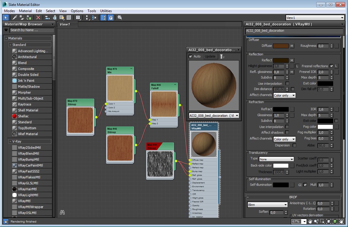
Materials
Click on image to enlarge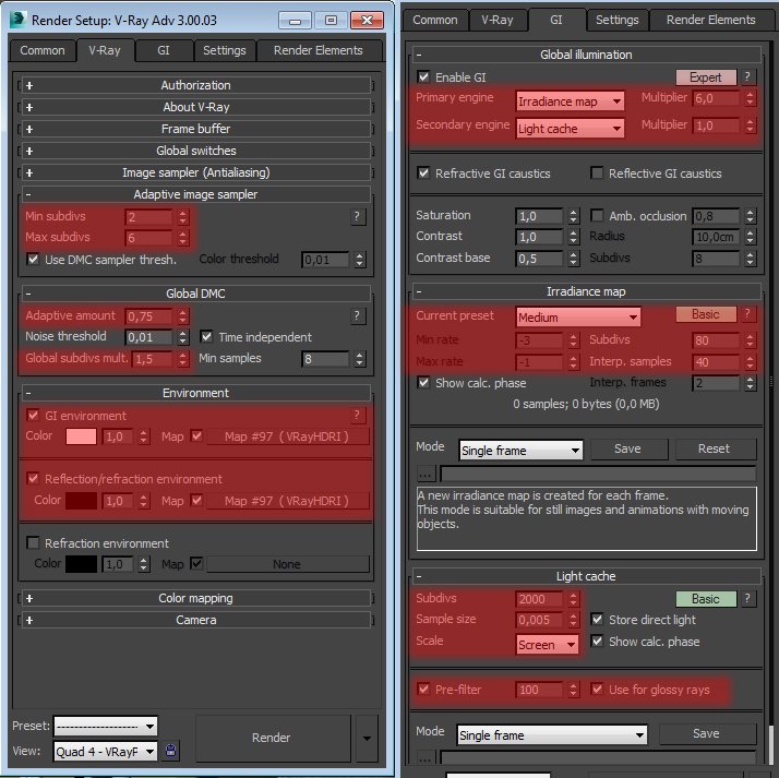
The final GI and sampling settings
Click on image to enlarge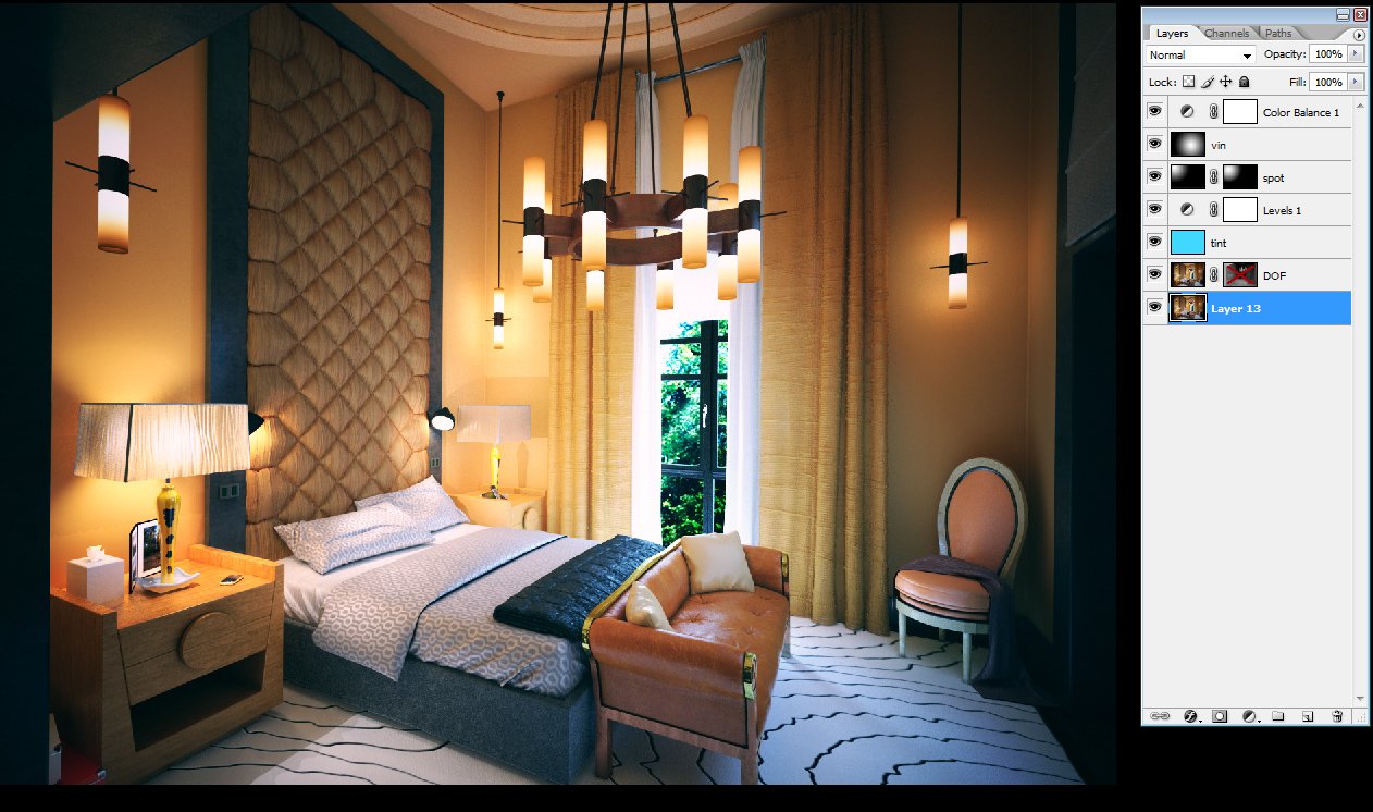
The final render was very close to what I've intended so in post production I only added some tint, vignette and tweaked a contrast.
Click on image to enlarge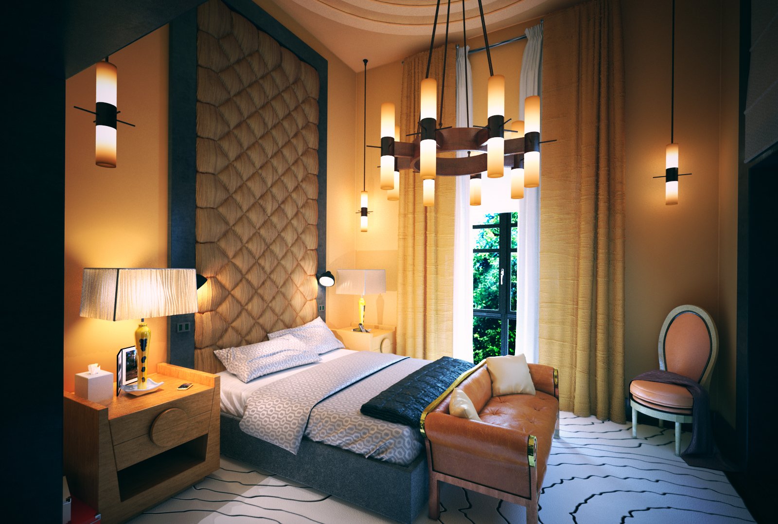
Final work
Archinteriors vol. 32 collection is available here.
 How To Make Your CGI Walls More RealisticRealistic walls with noise modifier.
 Removing LUTs from Textures for better resultsRemove the LUT from a specific texture in order to get perfect looking textures in your render.
 Chaos Corona 12 ReleasedWhat new features landed in Corona 12?
 OCIO Color Management in 3ds Max 2024Color management is crucial for full control over your renders.
 A look at 3dsMax Video SequencerDo you know that you can edit your videos directly in 3ds Max? Renderram is showing some functionalities of 3ds Max's built in sequencer.
 FStorm Denoiser is here - First ImpressionsFirst look at new denoising tool in FStorm that will clean-up your renders.
Customer zone
Your special offers
Your orders
Edit account
Add project
Liked projects
View your artist profile






COMMENTS