Hi everyone, before I get started I would like to introduce myself:
I am Vittorio Bonapace, owner and founder at Vittorio Bonapace Studio and Senior Visualization Leading Artist at Cityscape Digital in London.
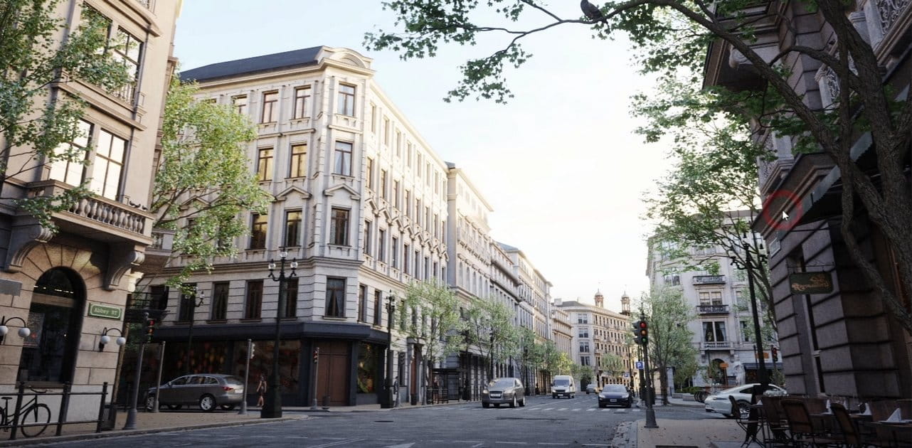
This image was an entry and then Award Winning for the “A Day in the City | 2018” Evermotion Challenge. The project was created with 3ds Max, V-Ray and Photoshop.
Let’s start with the message and a concept thought, just to frame the general feeling.
“A calm dawn to connect nature, humans and architecture.
We look through timeless patterns chasing dreams and beauty”
My very first idea came out while I was looking for a winter city park feeling image and I found this photograph.
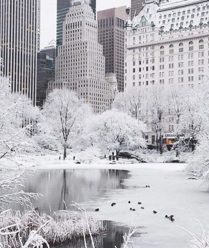
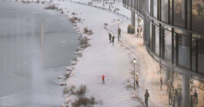
I started researching specific references to complete the winter park picture in my mind.My idea was to create an image able to connect Architecture to Public Realm, able to express cold and warm feelings at same time. I found out that answer was a colder atmosphere of a park warmed up by people life activity, low sun rays and glare reflections on the building. And about a human story: a kid playing with a kite.
This is my Mood Board I created with concept images I researched so far and finally took as references.
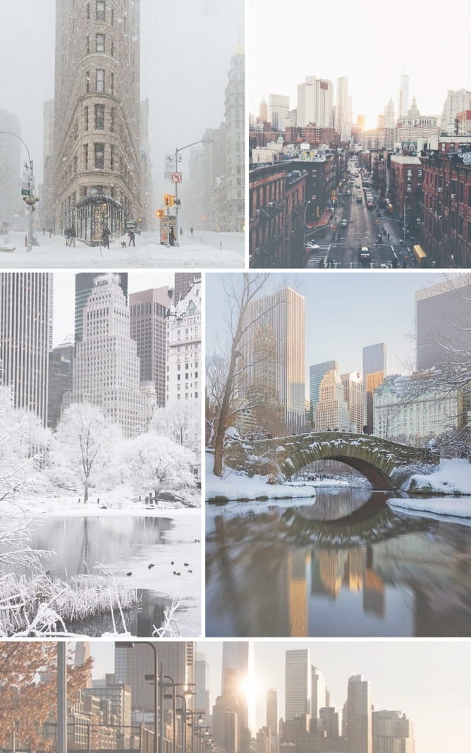
I collected all the images in a single file that I usually print in order to have ever references close to my attention. I think this is very important because this allow us to keep the mood in our mind and not take other directions during the workflow. One image express the winter feeling, one express the sun glare effect I wanted to achieve and few more to tell about safe and warm feeling in the general cold atmosphere.
Here is the sketch I did at the very beginning of the process.

A preliminary Mood Draft to refine in 3D my concept idea.
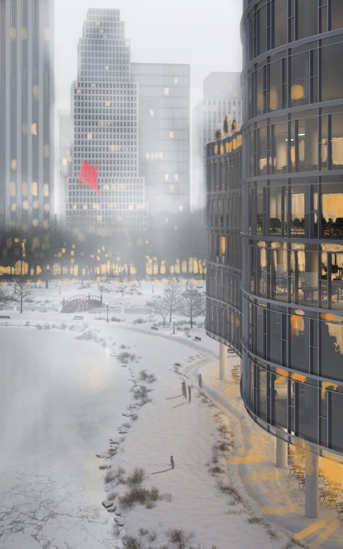
Sketches always allow me to fix the concept ideas in a clear way in my mind. From that point on, I know everything will work for sure.
I added the sketch image in the max background to have a reference and first thing first I created the volumes of the buildings, the street and the edge profile of the lake.
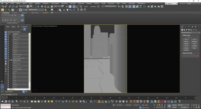
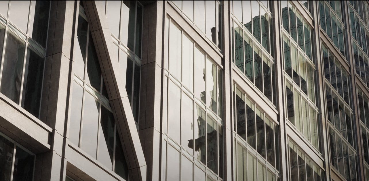
The main building was modeled with path deform modifier. The building has three straight sides and only one curved, so it was enough for me to build the geometry of the facade and repeat it on the sides for the straight sides. I used the path deform modifier for the curved part. I copied the geometry and attached it to the others by welding the vertices and I applied the modifier.
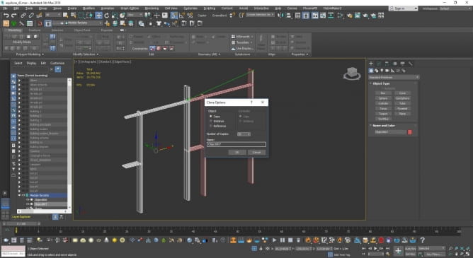
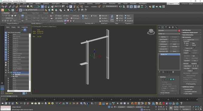
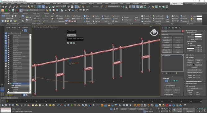
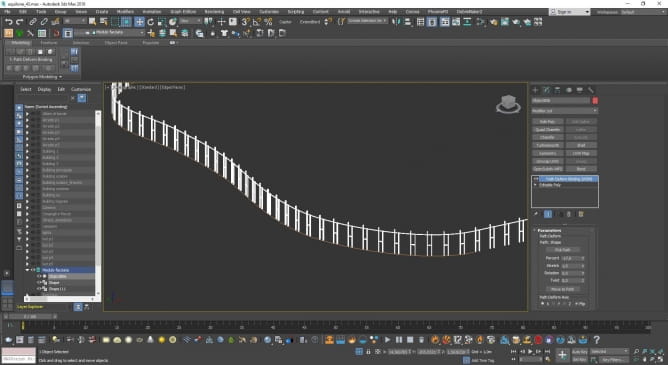
The other buildings were modeled in a different way, since the position was so far from the camera. I followed some references to model them and they are made with few shapes. I didn’t spend so much time in doing this because I had a clear Mood Board and I knew that most of the buildings were disappearing in the mist.

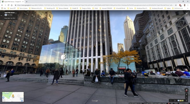
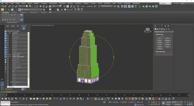
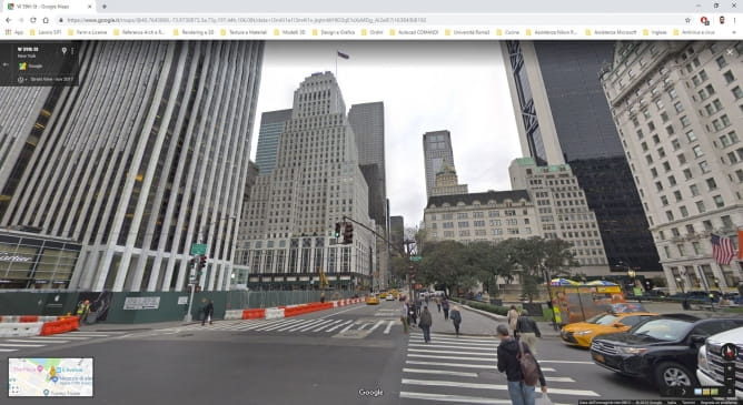
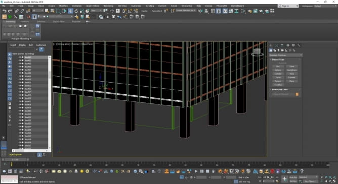
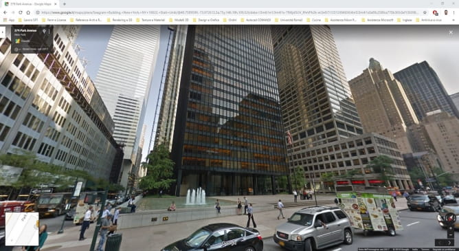
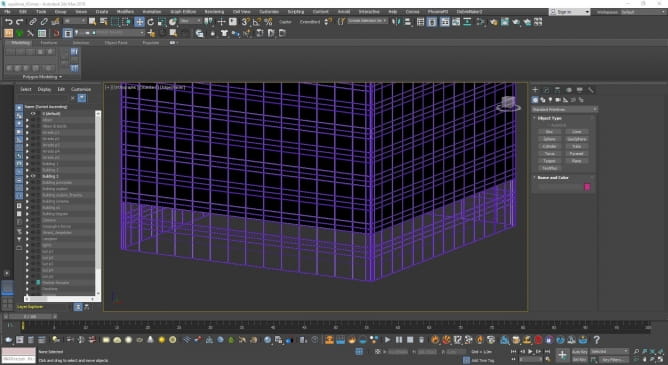
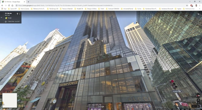
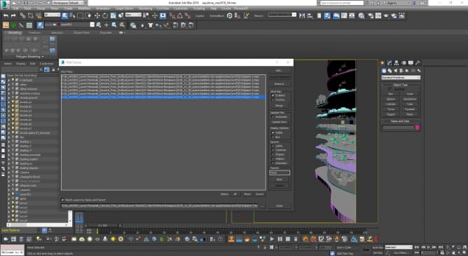
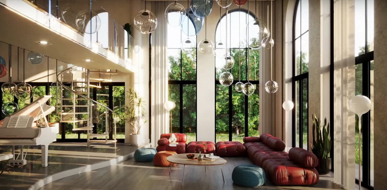
The furnishings have been modeled and added following my camera position. I used X-ref of course to manage in a best way possible the scene.
I kept every single floor on a separate x-ref, to work it easily. I just kept lighting on the main file to easily manage lighting structure and do quick lighting tests.

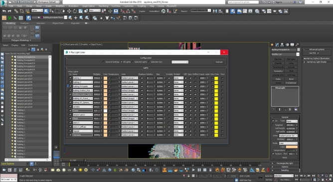
The general lighting has been created using an HDRI into the v-ray dome. Here some screengrabs of my lighting hierarchy.
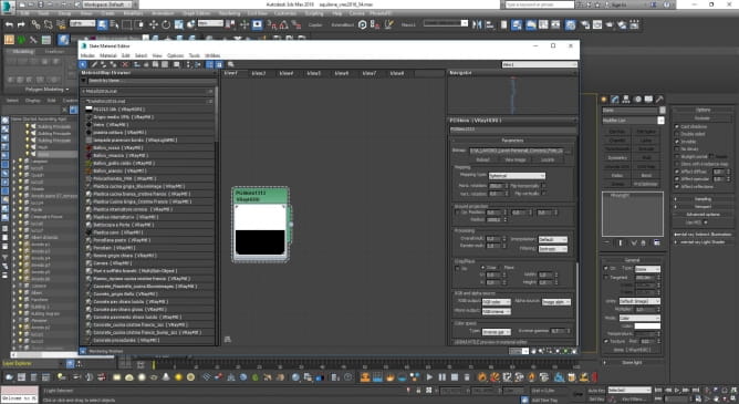
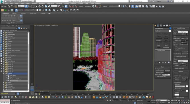
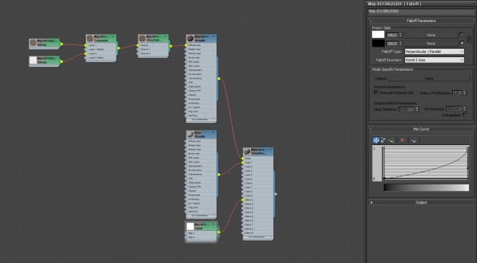
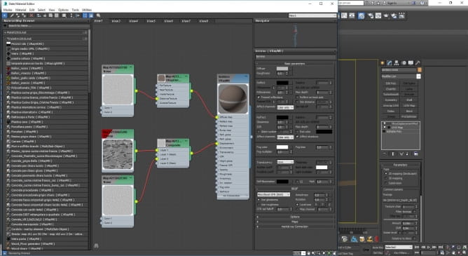
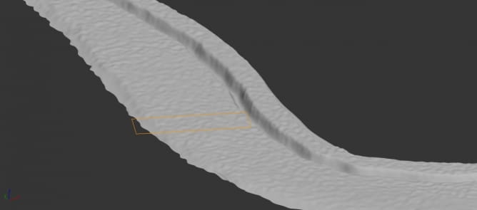
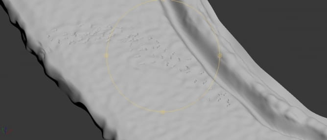
The snow is a simple VrayMtl. I made this choice because of my distance from the ground level. In this specific case, since I didn’t need any detail at all, I was happy with a simple gray material. I spent more time in modeling the snow mesh in order to have clear dark shades.
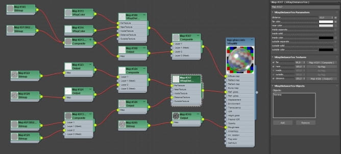
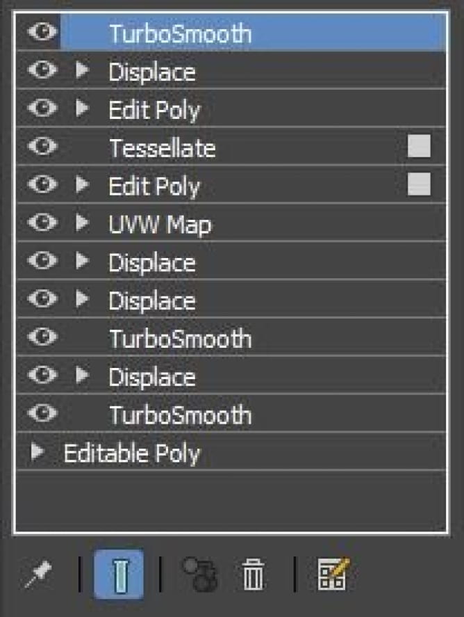
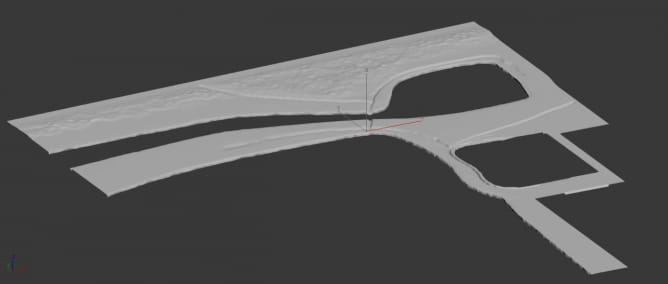
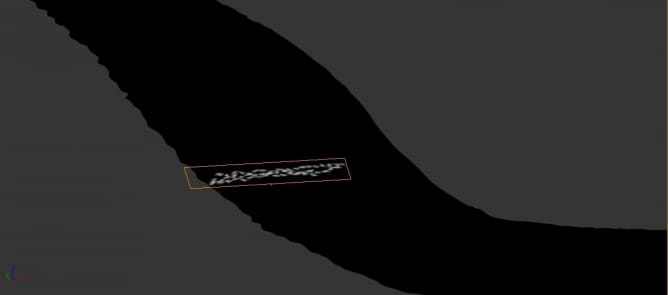
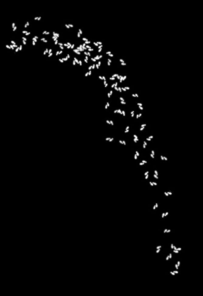
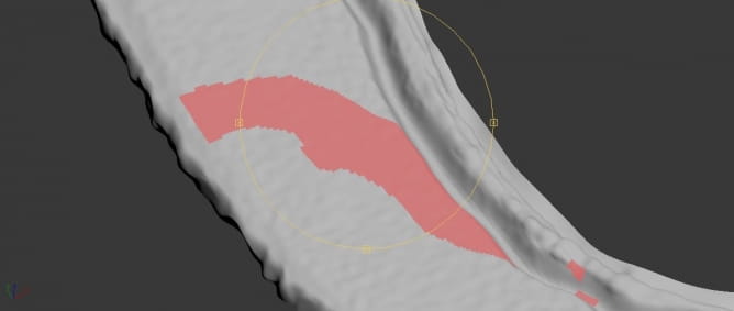
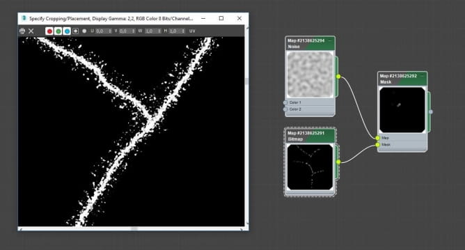
I roughly modeled the shape form the scratch. Following the sketch in the viewport background I moved some vertex first. I converted it to editable poly and I used the Populate Terrain plugin to split the mesh into polygons. Then I sculpted with the 3DSMax freeform tool to start giving movement to the surface. I added various modifiers.
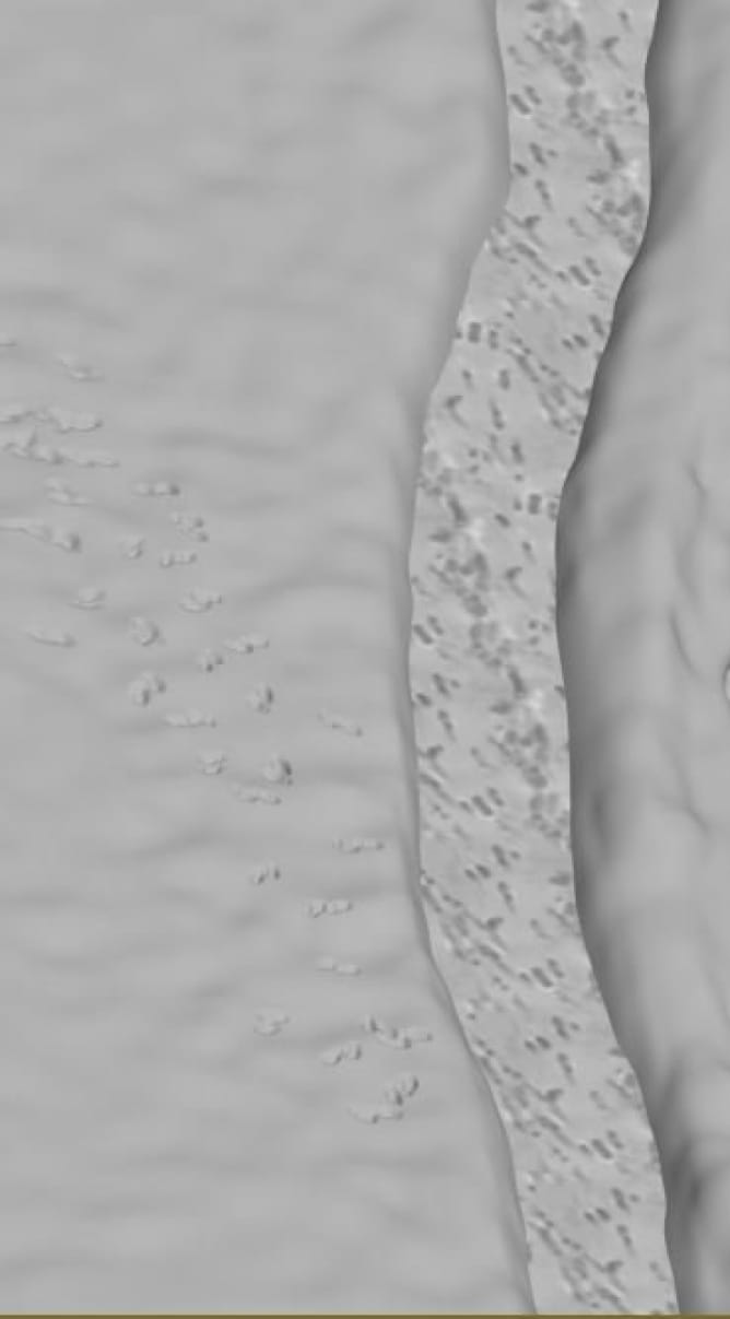
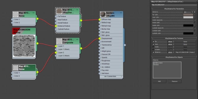
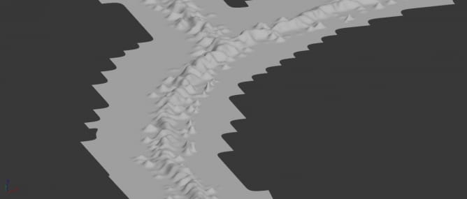
Displacement: I refined the maps in Photoshop. For the general mesh movement I used noise maps.
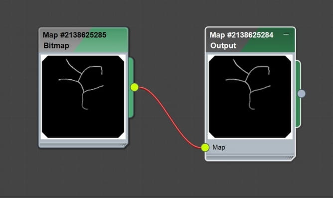
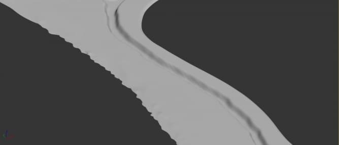

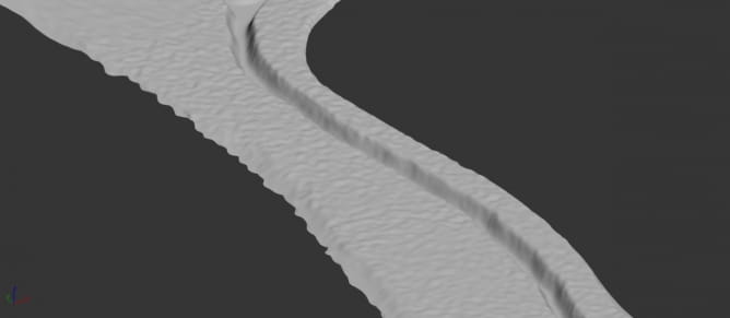
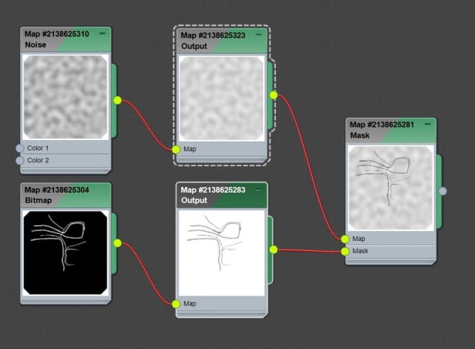


Once I rendered my scene with all my elements I jumped in PSD and I started my post-production. I will show you before and after the process.
Raw render:
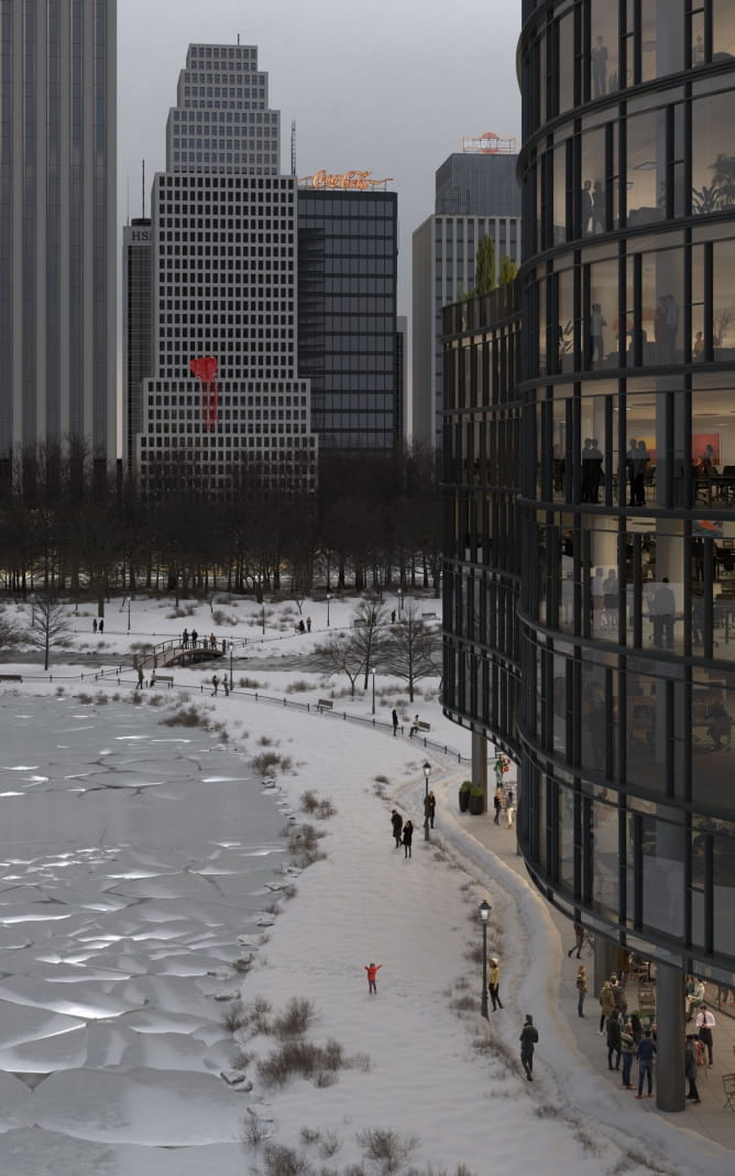
Final render:

First thing first I started picking up some geometry and define better the shapes, with curves. Separately, I rendered lake with a different material from the original max scene, just to have more informations to composite the image.
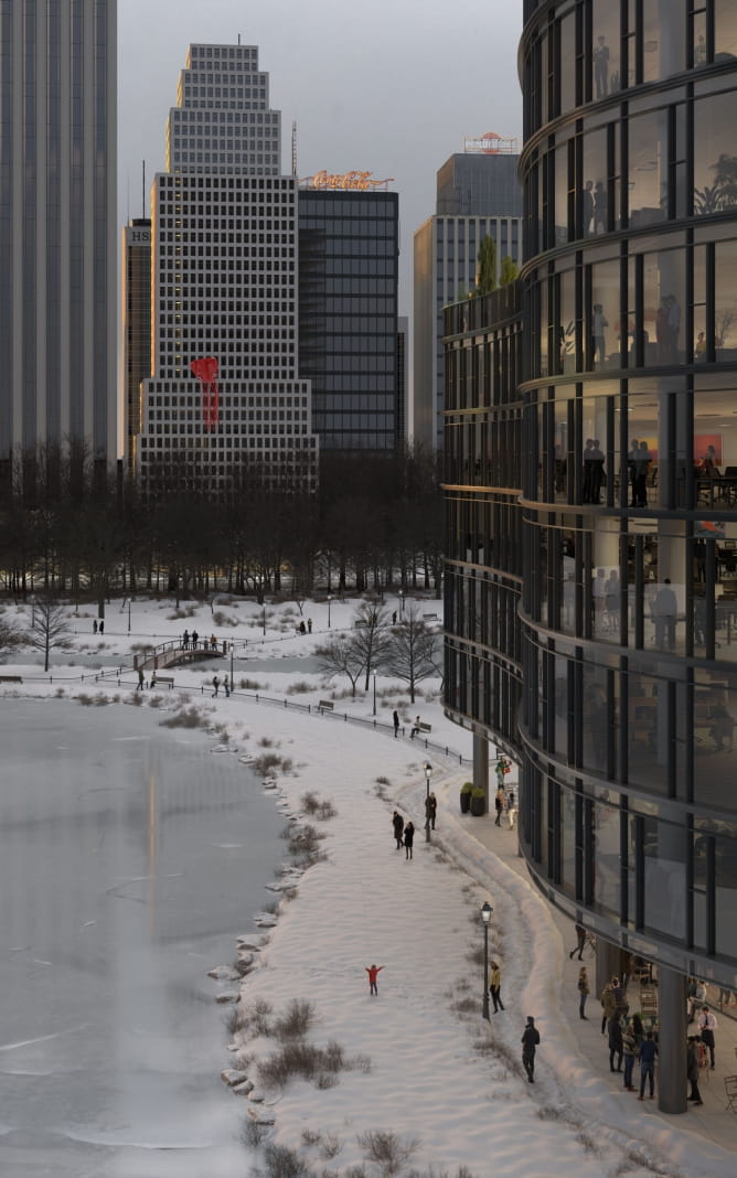
I added z-depth map to define my main shape (building) from the background.
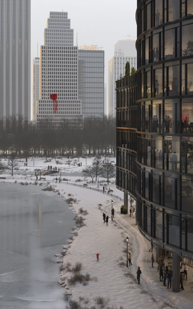
I added some passes to make glass more vibrant (vray_reflection, vray_raw_reflections, vray_refraction, vray_extratext, to create occlusions)
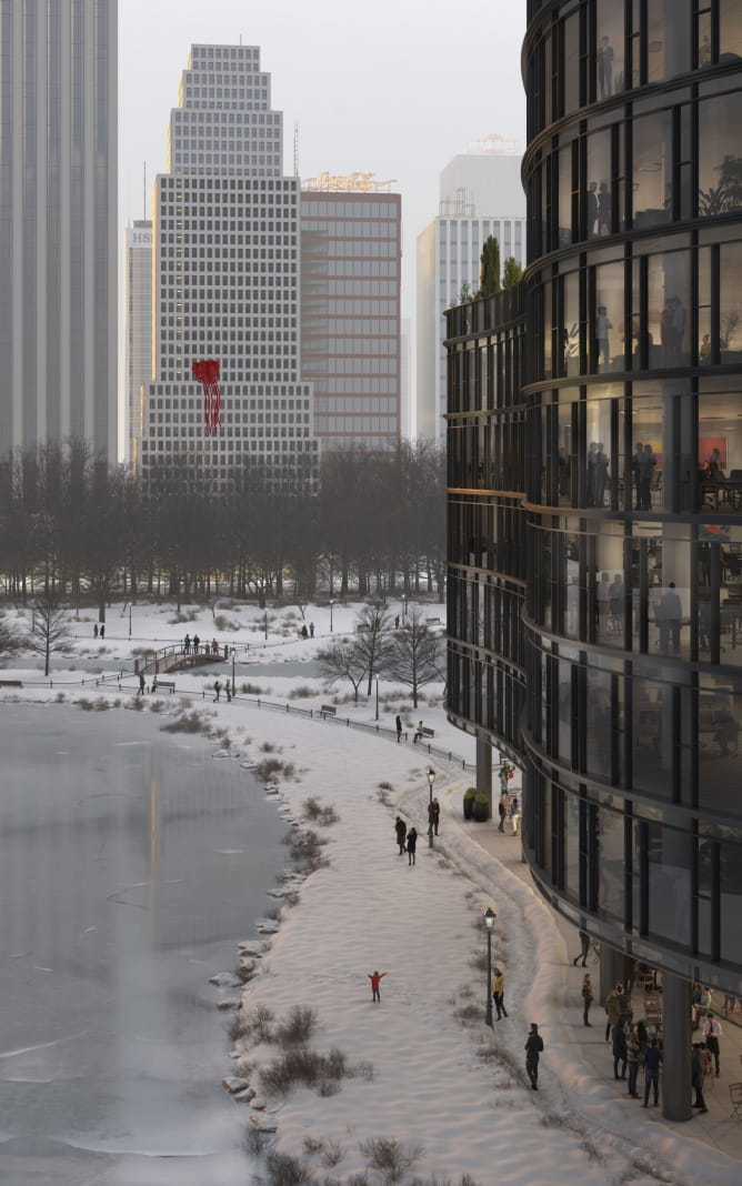
At this point I started work with vray_raw_lighting pass, light select passes and psd free painting to give life to the building.
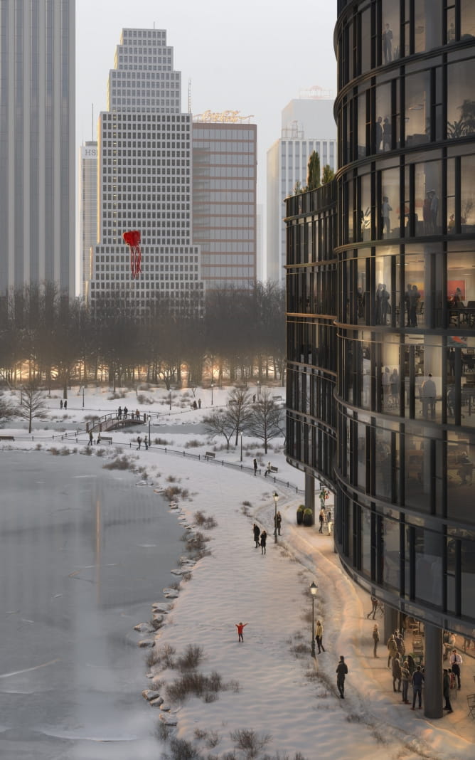
I added fog with z-depth map and curves, creating more depth into the image.
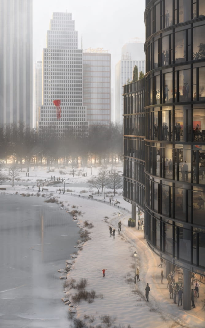
I worked at some refinement as glass reflections, people light painting (starting from vray_raw_lighting pass) and highlights painted details.
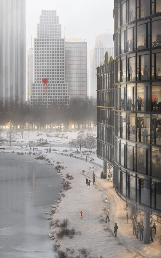
Here is my final grade on the image, and following some close up cropped images.
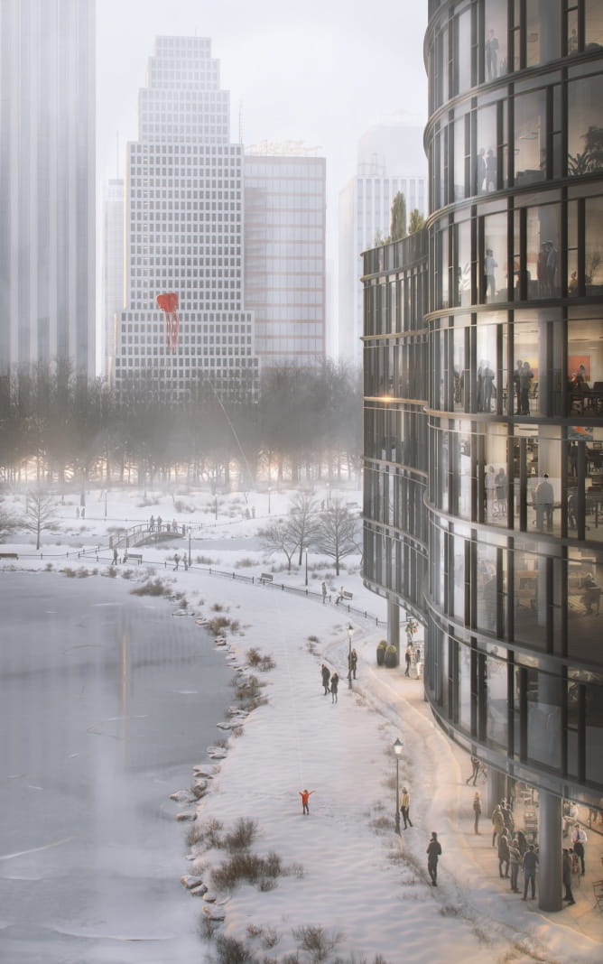
Hope you enjoy! Thanks!
Link Behance: https://www.behance.net/Vittorio_Bonapace
Website: www.vittoriobonapace.com
Instagram: Vittorio Bonapace 3D Artist
Software Used: 3ds Max, V-ray and Photoshop
Credits: AXYZ People Models: https://secure.axyz-design.com/
Customer zone
Your special offers
Your orders
Edit account
Add project
Liked projects
View your artist profile





COMMENTS