How To Make Your CGI Walls More Realistic
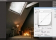
Realistic walls with noise modifier.
Total: € 0
Continue Shopping
In accordance with the art. 13 section 1 and 2 of the European Parliament and Council Regulation 2016/679 of the 27th April, 2016 on the protection of natural persons, with regard to the processing of personal data and on the free movement of such data, and repealing Directive 95/46/EC (General Data Protection Regulation), hereafter RODO, I hereby inform that:
1. EVERMOTION S.C., 8 Przędzalniana Str., 15-688 Białystok, Poland is the Administrator of your Personal Data (APD)
2. Data Protection Inspector can be reached through e-mail: iod@evermotion.org
3. Your personal data are to be processed on the basis of art. 6 section 1 letter a, b and f of RODO in order to:
a) prepare, conclude and execute the agreement and for other purposes approved by you,
b) to execute the legitimate interest like marketing of products and the agreement, claim assertion or defence against claims resulting from the law regulations.
4. Entities entitled to the reception of your personal data may be the authorised public bodies; mail providers; providers of the services covered by the agreement; responsible for debt recovery, keeping the archives, document utilization, legal consulting, technical services, IT services and accountancy.
5. Your personal data shall not be transferred to the third country, nor to the international bodies.
6. Your personal data shall be processed within the period of the agreement and upon your additional consent until you withdraw it. APD shall keep the data for the period of any civil law claim execution connected with the agreement.
7. You have the right to demand an access to your personal data, to correct or to delete the data if there is no other basis for the processing or any other purpose of such processing or to limit the processing of the data, to transfer the data to another administrator and to raise objections to the further data processing if there is no legal basis for further processing and to withdraw any previous consent.
8. You provide the personal data voluntarily, however they are necessary to conclude the agreement. The refusal of providing such data may result in the refusal of the agreement conclusion.
9. You have the right to lodge a complaint to the Personal Data Protection Office when in your opinion the data processing violates the regulations of General Data Protection Regulation of the 27 April, 2016 (RODO).
10. Your data will be automatically processed, including the form of profiling.
11. You are obligated to forward above mentioned information to your representative, especially if you appointed this person in the agreement as the contact person or as the representative for the agreement execution.


STEP 2
I aimed for a reddish colour-scheme with small deviations to yellow in the lighter areas and purple in the shadows. To achieve this, I painted in the colours on a new layer set to "Color" mode, retaining all the value information below. I picked out some of the main hues and made a small colour palette directly in the canvas. This helps me in maintaining colour harmony by always colour-picking from the same source. This is important in the early stages, but later on all the colours can be picked up from any part of the painted image. I then started detailing the foremost figure so I could get an early idea of what the painting process on the other two figures was going to be. I mainly used hard-edged brushes for the initial block-in and then I continuously decreased the brush's hardness, size and opacity. This can be a slow process and should be done patiently. Most of the times I have to do several painting "passages" to get to the point where I am satisfied, especially with smooth textures.


LEAVE A COMMENT


|

|

|

|

|
 Customer zone
 Your special offers
 Your orders
 Edit account
 Add project
 Liked projects
 View your artist profile
COMMENTS