Evermotion: More Than an Asset Library
How Evermotion became a full-scale production partner for archviz, automotive and synthetic data.


Total: € 0


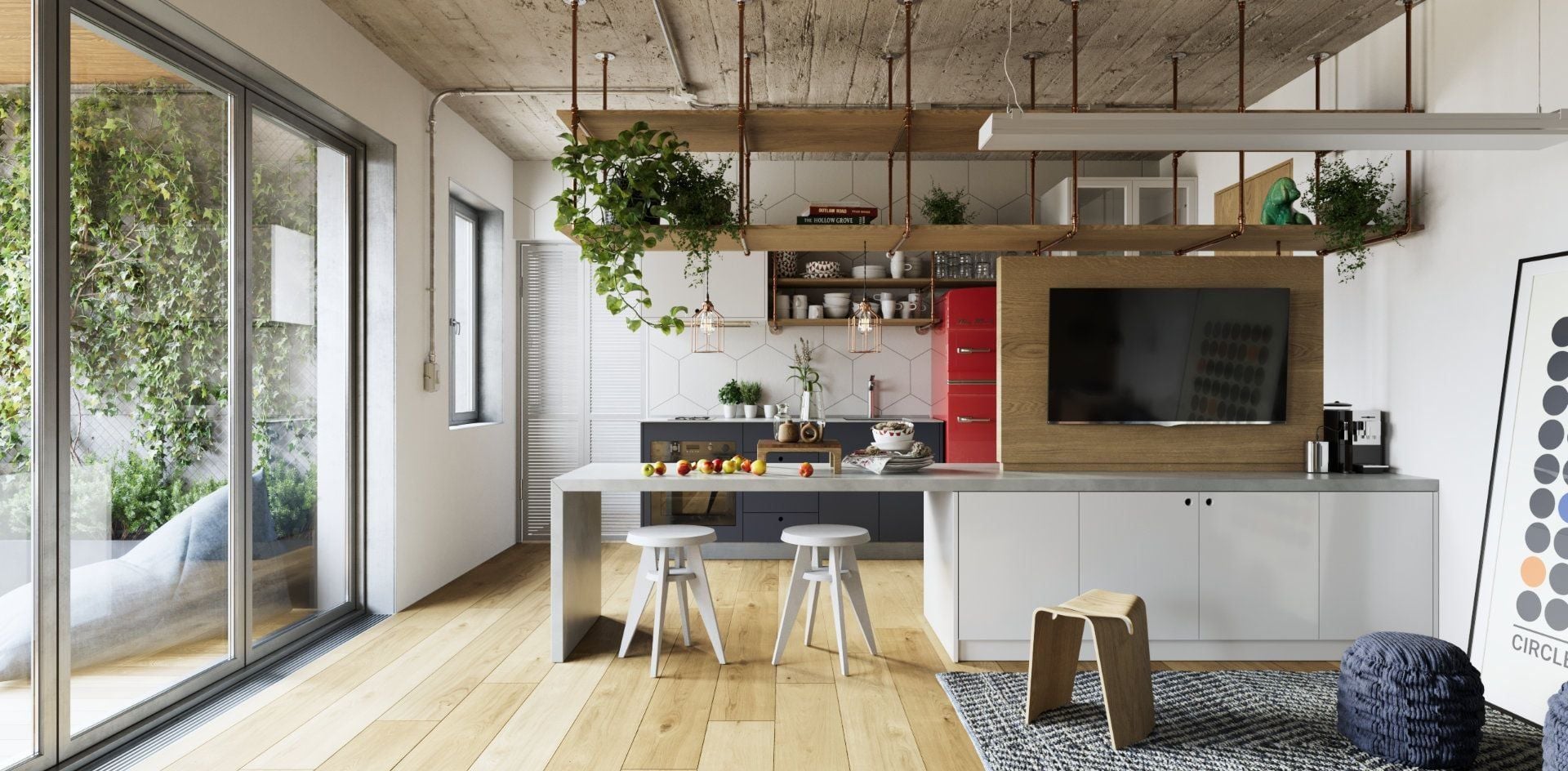
The purpose of photorealistic visualization is not only to impress—it’s to provide clear and reliable visuals that support professional decision-making. Clients rely on these renderings to evaluate proportions, materials, and spatial relationships. Visualizations should therefore reflect reality with as much fidelity as possible. This includes accurate material properties, realistic lighting behavior, and balanced composition. When images are built on consistency, the result is not just beauty—it’s clarity. Effective renderings allow architects, product designers, and marketers to communicate their intentions without the need for additional explanation.
When visualizations follow real-world logic, they generate trust. A shadow in the wrong place or an unnatural reflection can break immersion. Every element must follow visual rules grounded in physical behavior. That’s why techniques like IBL (image-based lighting), HDR environments, and calibrated material settings are standard practice. The goal is not artistic interpretation—it’s precision.
Photorealism doesn’t require complex storytelling or exaggerated elements. It requires subtlety: the right amount of texture detail, believable depth of field, and appropriate scale between objects. This creates a visual experience that doesn’t distract from the product but supports its intended function. A strong product presentation allows clients to analyze without guessing, review without hesitation, and move forward with confidence.
A successful visualization depends as much on layout as it does on lighting or materials. Composition controls the viewer’s attention and helps communicate purpose. If an object is centered with too much space, it may seem disconnected from its environment. If it’s too close to the edges of the frame, details may be lost. The arrangement of space should be intentional, supporting a natural visual flow from the focal point to the context.
The choice of camera angle and framing communicates how a product should be perceived. Wide-angle lenses can introduce perspective distortion; narrow lenses, on the other hand, tend to flatten the subject. A balanced middle ground helps present the item in a neutral, realistic way. Negative space can be used to highlight form, but it must not dominate the image. Props and environment elements should support the visual message—not compete with it.
Good composition minimizes the need for post-production corrections. It ensures that each render communicates effectively without requiring additional editing or explanation. Attention to alignment, background balance, and proportions improves client understanding from the first impression. When structured correctly, a scene becomes a tool for communication—not just decoration.
Visual simplicity creates clarity. Clean backgrounds, appropriate object scaling, and subtle gradients help keep attention where it matters most. These techniques are essential in any professional product presentation and contribute directly to its commercial impact.
Material realism is a defining element of high-end rendering. Surfaces must not only look correct—they must behave correctly under light. Whether it’s brushed metal, matte plastic, or clear glass, each material should be accurately represented in terms of roughness, reflection, and color response. These factors work together to produce a render that mirrors how the object would appear in a real-world setting.
In addition to base properties, micro-detailing through bump and normal maps adds surface complexity. These small adjustments can make a surface feel tactile without increasing mesh complexity. Used correctly, these details avoid repetition and give each element a unique feel. Imperfections, such as fingerprints, smudges, or light wear, can be subtly added to enhance believability.
Texture resolution and UV mapping also affect output quality. Even the best materials lose impact if their textures are stretched or rendered at low resolution. That’s why efficient asset structure is essential: it ensures the visuals hold up under close inspection. Details should not be added randomly—it should be based on the material’s physical properties and its role in the composition.
Realistic materials help bridge the gap between concept and production. They provide stakeholders with a better understanding of the final product, support technical reviews, and enhance stakeholder buy-in. When visual details are accurate and polished, the product becomes more than just a 3D object—it becomes a visual proof of concept.
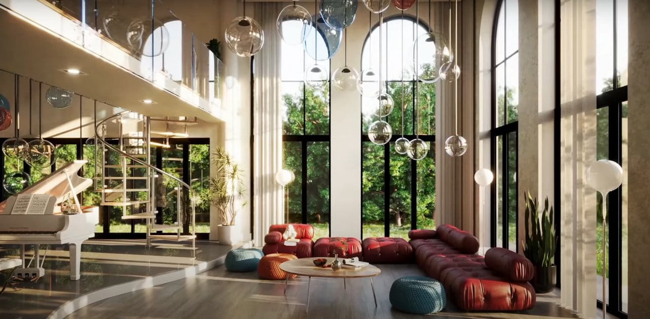
Light defines form. Even the most well-modeled product will appear flat without proper lighting. Choosing a lighting setup involves more than just brightness or direction—it’s about utilizing contrast, color temperature, and softness to achieve natural-looking results. In a neutral setup, soft shadows and gradual transitions highlight curves and edges without overpowering them.
Multiple light sources should be managed carefully. Too many, and reflections become chaotic. Too few, and the subject may appear underexposed. A strong visualization uses light to define geometry, reveal surface properties, and create spatial relationships. Softboxes, area lights, and HDR environments help achieve these effects without introducing visual noise.
Lighting is also a tool for emotional control. Cool lighting feels sterile and modern. Warm tones feel more inviting. The choice depends on the intent of the presentation. However, consistency is more important than mood. If different renders of the same product use different lighting, the result feels disconnected. A consistent lighting scheme keeps the focus on the design rather than the image style.
Realistic lighting requires a deliberate workflow. Testing different angles, shadows, and intensities helps refine the output. Good lighting eliminates the need for excessive post-processing. It allows the product to speak for itself and keeps attention where it belongs: on design, not decoration.
Technical precision makes a visualization reliable. A scene with clean geometry, optimized textures, and consistent scale is easier to use and renders faster. These factors contribute to better performance and reduce the chance of visual errors during production. Clean topology enables smooth shading and UV unwrapping, which are essential for professional outputs.
Scenes should be structured to support reusability. Naming conventions, layer organization, and grouped assets simplify the editing process. When assets follow a clear logic, they are easier to adapt to new projects or adjust based on client feedback. In commercial visualization, these details matter.
Mesh optimization also plays a role. Redundant geometry increases render times and can cause lighting artifacts. Removing hidden faces, reducing unnecessary subdivisions, and using instances instead of duplicates improves efficiency. These aren’t just technical best practices—they directly affect the visual outcome.
A reliable visualization setup means faster approvals, fewer corrections, and consistent results. That’s what clients expect when working with experienced professionals. Accuracy isn’t about complexity—it’s about discipline. And it leads to better output, every time.
Once a visualization system is built on consistency, it becomes scalable. A reliable asset can be used across various scenes, projects, or presentations without compromising quality. This saves time and supports brand coherence. Using professionally developed libraries reduces the need to create elements from scratch, allowing teams to focus on layout and lighting instead.
This is where resources from Evermotion add long-term value. High-quality 3D assets streamline workflows and enhance results. We support repeatable visual styles, making scaling visual campaigns more manageable. Whether used for catalogs, client presentations, or internal reviews, consistent assets lead to more predictable outcomes.
Maintaining a central visual language helps projects feel cohesive—even across different mediums. From studio presentations to marketing campaigns, clients respond better to visuals that appear cohesive and well-integrated. Scalable visual resources reduce creative drift and improve efficiency in collaborative workflows.
A strong asset library is not just a storage tool—it’s a foundation for visual quality control. When used with intention, it supports every phase of production, from concept to final delivery.


LEAVE A COMMENT


|

|

|

|

|
 Customer zone
 Your orders
 Edit account
 Add project
 Liked projects
 View your artist profile
COMMENTS